4 Categorical variables and interactions
In the models considered thus far, we have had exclusively continuous covariates (multiple linear regression models). In reality, we are often faced with variables of other types within the same dataset, such as categorical covariates, e.g. smoking status or mode of transport. We will now consider a model with both types of covariate.
4.1 Indicator and dummy variables
Let us consider an example where there appeared to be a linear relationship between weight and length in both male and female lobsters. We may want to consider:
- Is there a difference in the intercepts between males and females?
- Is there a difference in the slopes?
To handle a binary covariate, we can define an indicator variable which indicates the sex of the lobster. Let \(x_{i1} = 0\) for a male and \(x_{i1} = 1\) for a female, i.e.
\[ \color{red}{x_{i1} = \begin{cases} 1& \text{if `Female`} \\ 0& \text{if `Male`} \end{cases}} \]
This can also be written as \(I(x_{i1} = \text{`Female`})\), where \(I()\) is an indicator variable, taking the value 1 if the condition in parentheses is true, and zero otherwise. An indicator always takes the values 0 or 1, to indicate the absence or presence of a particular characteristic (here the characteristic is ‘female’).
If all the regressor variables are indicator variables, then we are actually dealing with anova models (as we will see in Chapter 5); if some of the regressor variables are indicator variables, then we have analysis of covariance (ancova) models. Our first example of using indicator variables will be to fit two simple linear regression equations simultaneously. Consider the model:
\[ Y_i = \beta_0 + \beta_1 x_{i1} + \beta_2 x_{i2} + \epsilon_i \]
for \(i = 1, \ldots, n\), where \(x_{i1}\) is an indicator variable and \(x_{i2}\) is a continuous variable. Then
- \(\mathrm{E}(Y_i \mid x_{i1} = 0) = \beta_0 + \beta_2 x_{i2}\), and
- \(\mathrm{E}(Y_i \mid x_{i1} = 1) = (\beta_0 + \beta_1) + \beta_2 x_{i2}\)
for \(i = 1, \ldots, n\). So what we are really doing is fitting two regression lines with a common slope, i.e. two parallel lines. The lines are separated in the vertical plane by the value of \(\beta_1\). Hence, if this value is close to zero then one line will suffice. Formally, we can test for a common intercept by testing
\[ \color{red}{H_0: \beta_1 = 0 \;\;\text{versus}\;\; H_1: \beta_1 \neq 0} \]
in the usual way (i.e. we are testing for a common line, which corresponds to no difference between the two categories). To fit two lines with different slopes, we fit:
\[ \color{red}{Y_i = \beta_0 + \beta_1 x_{i1} + \beta_2 x_{i2} + \beta_3 x_{i1} x_{i2} + \epsilon_i, \;\; i = 1, \ldots, n} \]
Under this formulation
- \(\mathrm{E}(Y_i \mid x_{i1} = 0) = \beta_0 + \beta_2 x_{i2}\)
- \(\mathrm{E}(Y_i \mid x_{i1} = 1) = (\beta_0 + \beta_1) + (\beta_2 + \beta_3) x_{i2}\)
for \(i = 1, \ldots, n\). This is an interaction model! We can test for a common slope via \[ \color{red}{H_0: \beta_3 = 0 \;\;\text{versus}\;\; H_1: \beta_3 \neq 0.} \]
Example: Gasoline data
The data in the file gasoline.RData gives the gasoline mileage (\(y\)), the engine displacement (\(x_1\)) and the type of transmission (\(x_2\)) for a sample of cars, where \(x_2\) is coded as 0 for automatic transmission and 1 for manual transmission.
We begin by plotting the data. We can use the command xyplot() to produce an appropriate plot (although plot() can also be used with different symbols for each factor level).
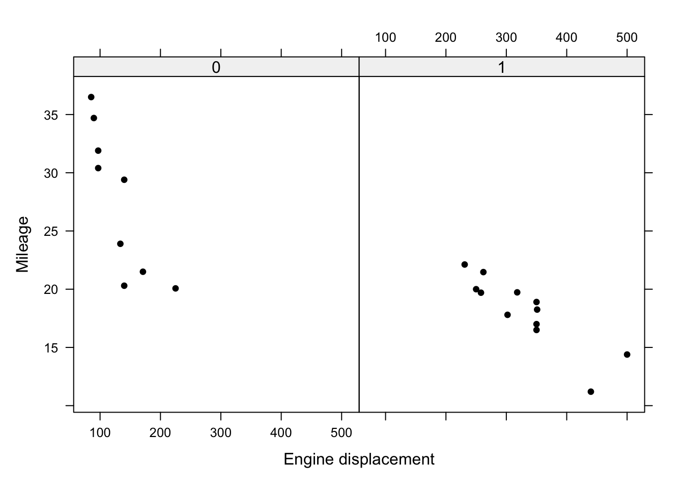
Figure 4.1: Plot of mileage against engine displacement by transmission type.
There is a clear difference in the intercepts with most automatic transmission points above manual transmission points. Mileage declines with engine displacement, and it looks like the rate of decline may be different for the two transmission types. In particular, there looks to be a steeper decline for cars with automatic transmission. Let us see what happens if we fit a common line, i.e. ignore transmission type.
##
## Call:
## lm(formula = y ~ x1, data = gasoline)
##
## Residuals:
##     Min      1Q  Median      3Q     Max
## -6.9498 -1.8377 -0.0842  1.8158  6.6023
##
## Coefficients:
##              Estimate Std. Error t value Pr(>|t|)
## (Intercept) 34.026933   1.674994  20.315 2.40e-14 ***
## x1          -0.048408   0.006168  -7.848 2.22e-07 ***
## ---
## Signif. codes:  0 '***' 0.001 '**' 0.01 '*' 0.05 '.' 0.1 ' ' 1
##
## Residual standard error: 3.324 on 19 degrees of freedom
## Multiple R-squared:  0.7643, Adjusted R-squared:  0.7519
## F-statistic:  61.6 on 1 and 19 DF,  p-value: 2.224e-07
Comments:
- We can see that engine displacement gives a very small \(p\)-value , suggesting that this is very important.
- However, we have ignored the crucial information on transmission type, and this can give misleading conclusions.
We can add the fitted line to the raw data using abline(m1):
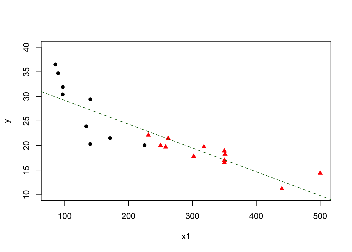
Figure 4.2: Plot of mileage against engine displacement by transmission type with line of best fit overlaid.
We can see that the line captures that there is a decline with engine displacement. However, it does not fit the data well, particularly for automatic transmission cars, because we have ignored transmission type. We will now add in the transmission type, allowing a test of
\[ \color{red}{H_0: \beta_2 = 0 \;\;\text{versus}\;\; H_1: \beta_2 \neq 0} \]
We use the R commands
##
## Call:
## lm(formula = y ~ x1 + x2, data = gasoline)
##
## Residuals:
##    Min     1Q Median     3Q    Max
## -6.880 -1.970 -0.104  1.796  6.605
##
## Coefficients:
##             Estimate Std. Error t value Pr(>|t|)
## (Intercept) 34.12798    1.89989  17.963  6.1e-13 ***
## x1          -0.04963    0.01162  -4.271  0.00046 ***
## x21          0.34592    2.76144   0.125  0.90170
## ---
## Signif. codes:  0 '***' 0.001 '**' 0.01 '*' 0.05 '.' 0.1 ' ' 1
##
## Residual standard error: 3.414 on 18 degrees of freedom
## Multiple R-squared:  0.7645, Adjusted R-squared:  0.7383
## F-statistic: 29.21 on 2 and 18 DF,  p-value: 2.231e-06
We observe that the addition of the transmission type indicator variable is not significant, and \(R^2\) has not changed much either. Perhaps a common slope is a plausible claim?
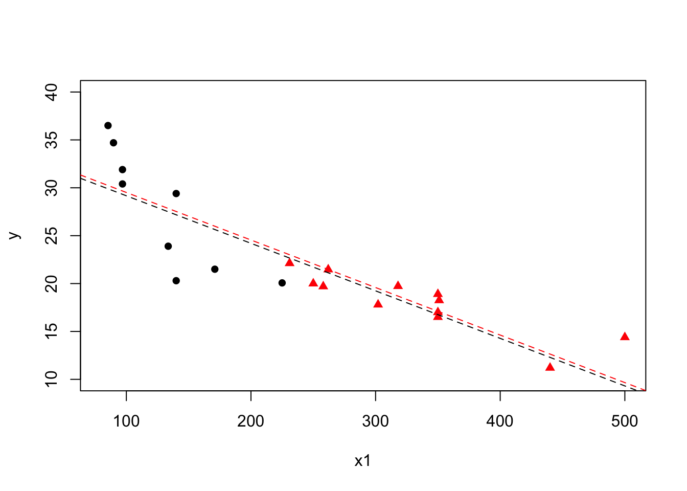
Figure 4.3: Plot of mileage against engine displacement by transmission type with lines of best fit for each transmission type overlaid (automatic - black, manual - red).
Are we overlooking something? What about the gradients? We now fit a model with different intercepts and different slopes
\[ \color{red}{H_0: \beta_3 = 0 \;\;\text{versus}\;\; H_1: \beta_3 \neq 0} \]
##
## Call:
## lm(formula = y ~ x1 + x2 + x1:x2, data = gasoline)
##
## Residuals:
##     Min      1Q  Median      3Q     Max
## -6.2712 -1.2042  0.2958  1.4758  3.5412
##
## Coefficients:
##              Estimate Std. Error t value Pr(>|t|)
## (Intercept)  42.91963    2.78705  15.400 2.04e-11 ***
## x1           -0.11677    0.02022  -5.776 2.24e-05 ***
## x21         -13.77463    4.36449  -3.156  0.00577 **
## x1:x21        0.08329    0.02252   3.699  0.00178 **
## ---
## Signif. codes:  0 '***' 0.001 '**' 0.01 '*' 0.05 '.' 0.1 ' ' 1
##
## Residual standard error: 2.615 on 17 degrees of freedom
## Multiple R-squared:  0.8695, Adjusted R-squared:  0.8465
## F-statistic: 37.75 on 3 and 17 DF,  p-value: 9.809e-08
We see that the \(p\)-value for the interaction is significant beyond the \(1\%\) level, suggesting the slopes are different and \(\beta_3 \neq 0\). Furthermore, we also see that the main effect of the transmission type is also now significant (also at the \(1\%\) level). The conclusion for engine displacement is largely as before, with a significant (and negative) coefficient although the magnitude has now changed. \(R^2\) has increased to around \(87\%\), indicating that this model captures more of the uncertainty in mileage.
These results highlight the need to always include all lower order terms up-to-and-including the highest order term. Adding the respective lines of best fit to the raw data now gives:
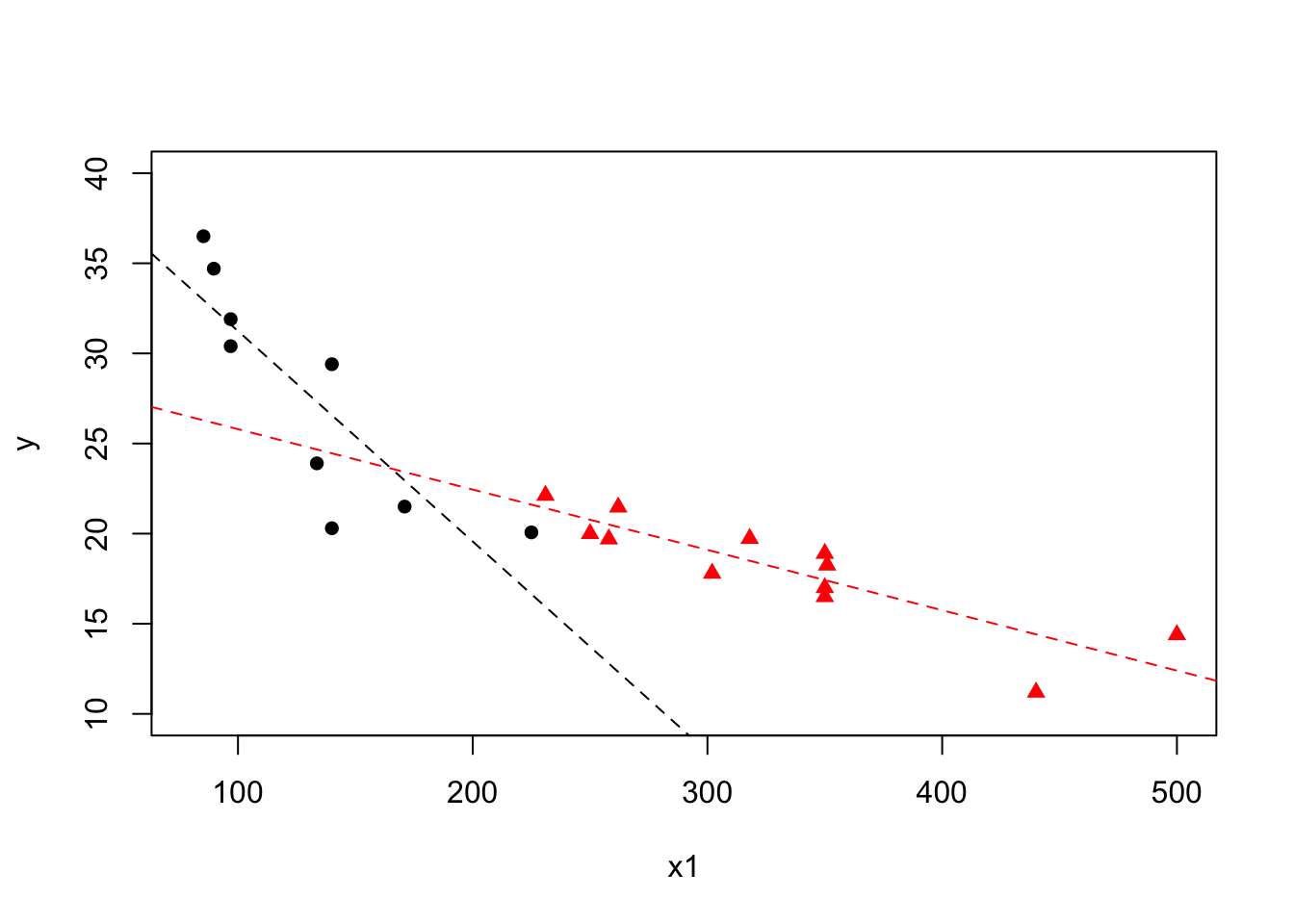
Figure 4.4: Plot of mileage against engine displacement by transmission type with lines of best fit for each transmission type overlaid (automatic - black, manual - red) from interaction model.
This is clearly a much better fit. Note the crossing lines, which are indicative of an interaction. Now that we are happier with our model we should carry out the usual residual checks (not included here).
Model interpretation
The final model is:
\[\begin{align*} \color{red}{\text{Mileage} = 42.92} &\color{red}{- 0.12\times\text{Engine displacement}} \\ &\color{red}{- 13.77 \times I(\text{Transmission type} = 1)} \\ &\color{red}{+ 0.08\times \text{Engine displacement} \times I(\text{Transmission type} = 1)} \end{align*}\]
This can be expressed as two separate models:
\[\begin{align*} \color{red}{\text{Type 0: Mileage}} &\color{red}{= 42.92 - 0.12\times \text{Engine displacement}} \\ \color{red}{\text{Type 1: Mileage}} &\color{red}{= 29.15 - 0.04\times \text{Engine displacement}} \end{align*}\]
Overall it can be seen that the mileage decreases by 0.12 for every unit increase in engine displacement when the transmission is automatic, and by 0.04 units when the transmission is manual. The decrease is greater when the transmission is automatic, as we would expect based on our initial plot. The effect of engine displacement differs according to the transmission type and two non-parallel lines must be used to model the data.
4.2 Model selection criteria
Recall \(R^2 = \text{RSS}/\text{TSS}\), is the coefficient of determination, i.e. the proportion of the total (corrected) sum of squares of the response \(Y\) explained by the model. The aim is to select a model that accounts for as much of this variation as is practical, i.e. we would like to only include regressors that are useful in some sense.
However, \(R^2\) cannot decrease as regressor variables are added to the model. Thus the maximum \(R^2\) will always be the model that contains all the regressor variables. As more regressors are added \(R^2\) increases, but ‘tails off’. Thus, we could choose \(k\) (the number of regressors to include) at the ‘elbow’. In addition, some alternative measures exist which can be minimised or maximised directly, removing some of the subjective issues based around using \(R^2\) alone.
4.2.1 Model selection criteria: adjusted \(R^2\)
The adjusted coefficient of determination is defined as
\[ \color{red}{R^2_{\text{adj}} = 1 - \frac{\text{RMS}}{\text{TMS}}} \]
where \(\text{RMS}\) is the residual mean square error and \(\text{TMS}\) is the total mean square error. This approach rescales \(R^2\) using the degrees of freedom. Assuming we have \(k\) degrees of freedom
\[\begin{align*} R^2_{\text{adj}} &= 1 - \frac{\text{RSS}/(n - p -1)}{\text{TSS}/(n - 1)} \\ \\ &= 1 - \frac{\text{(TSS - Reg SS)}/(n - p - 1)}{\text{TSS}/(n - 1)} \\ \\ &= 1 - (1 - R^2)\frac{n - 1}{n - p - 1} \end{align*}\]
This equivalence can also be stated as
\[ R^2_{\text{adj}} = \frac{(n - 1)R^2 - p}{n - p - 1} \]
Hence, to summarise
- \(R^2\) and \(R^2_{\text{adj}}\) are directly related.
- Adjusted \(R^2\) need not always increase as variables are added to the model.
- Adjusted \(R^2\) tends to stabilise around some upper limit as variables are added.
- The simplest model with an adjusted \(R^2\) near this upper limit can be chosen as the ‘best’ model.
4.2.2 Model selection criteria: Akaike’s Information Criterion
In 1974, Hirotogu Akaike developed a criterion for model selection that has since come to bear his name, Akaike’s Information Criterion, which is typically abbreviated as AIC. The criterion offers a compromise between model complexity and goodness-of-fit and is defined as
\[\begin{align*} \color{red}{\text{AIC}} &\color{red}{= 2(p + 2) - 2\ln L\left(\underline{\hat{\theta}}\right)} \\ &\color{red}{= 2(p + 2) + n\ln(\text{RMS}) + c} \end{align*}\]
where \(p\) is the number of regressors in the model (hence \(p+2\) is the total number of estimated parameters, including the residual variance), \(L\left(\underline{\hat{\theta}}\right)\) is the likelihood for the model, \(\underline{\hat{\theta}}\) is the vector of estimated parameters including the estimated residual variance. Also, \(\text{RMS} = (1 - R^2_{p, \text{adj}}) \text{TMS}\) and, hence, AIC is also a function of adjusted \(R^2\). The larger adjusted \(R^2\) is then \(n \ln (1 - R_{p, \text{adj}}^2)\), which is negative, becomes larger in absolute value. Therefore, AIC will also tend to choose a model with small \(p\), and with adjusted \(R^2\) close to its maximum.
4.3 Reducing the number of variables
Often a regression model will include irrelevant explanatory variables, or will omit important explanatory variables. We try to include enough explanatory variables to explain the variation in the response variable adequately, however we would like to keep the number of explanatory variables down, since the variance of the prediction, \(\hat{Y}\), increases as the number of regressors increases. From a set of potential explanatory variables, the choice of which subset to choose is therefore a compromise between the two aims.
4.3.1 Backward elimination
One unsophisticated method is to do the regression using all possible combinations of the explanatory variables and to just choose all the significant ones. This doesn’t work, because the explanatory variables all affect each other’s significance levels! It also requires the fitting of \(2^p - 1\) models, which may be unfeasible for moderate \(p\).
Instead, we shall initially consider the method of removing the variable with the largest \(p\)-value and continuing removing variables one at a time until all the remaining variables have small p-values (\(< 0.05\)), say, or there is no reduction in AIC. This is called backward elimination.
4.3.2 Forward selection
An alternative procedure is forward selection - this adds variables until the next candidate variable has a p-value > 0.05, say, or does not decrease the value of AIC. It does not necessarily lead to the same model as backward elimination, depending on the correlation structure of the variables. Backward elimination is generally considered a safer strategy.
4.3.3 Stepwise selection
We may be concerned that one-directional approaches, such as backwards elmination and forwards selection, lack flexibility as they make unanimous decisions about variables. Allowing a variable that has been removed at one step to subsequently return seems like a sensible approach - this is the idea behind stepwise selection. At each step this method looks at removing or adding variables, subject to some criterion, whereby variables can both enter and leave the model repeatedly; this is not the case with both backward elimination and forward selection. Starting with all the variables (i.e the full model), stepwise selection usually gives the same result as backward elimination; note that the model can also be initialised at the null model.
Automated selection using AIC
There is an automated procedure in R which performs each of the automated model selection methods, using Akaike’s Information criterion (AIC) as a stopping rule, which is useful when the number of potential regressors grows large. The procedure adds or removes variables until the minimum AIC is obtained. We can carry out the automated versions for each of backwards elimination, forward selection and stepwise selection using AIC in R using the step() command, with appropriate arguments.
4.4 Multicollinearity and the variance inflation factor
We have mentioned earlier in the module about the problems that can occur if there is a high correlation between the explanatory variables:
- Problems inverting \(\mathrm{X}^T\mathrm{X}\);
- Conflicting results between the omnibus test and tests for individual covariates.
Multicollinearity can also subtly lead to overestimation of standard errors and errors in relation to the importance of explanatory variables. When there are only two explanatory variables, we can calculate the correlation between them, but, as the number of explanatory variables increases, it can be difficult to see if there is a problem merely from the pairwise correlations. One approach is to calculate the variance inflation factor (VIF) for each explanatory variable.
4.4.1 Variance inflation factors
Consider a case where there are \(p\) possible explanatory variables. To calculate the VIF for the \(k^{th}\) explanatory variable, we regress \(x_k\) against the other explanatory variables, i.e. \(x_1, \ldots, x_{k-1}, x_{k + 1}, \ldots, x_p\). If \(R_k^2\) is the coefficient of determination from this model then
\[ \color{red}{\text{VIF}_k = \frac{1}{1 - R_k^2}} \]
As an ad hoc rule, we would consider removing a variable if \(\text{VIF}_k > 5\) and its associated \(p\)-value is large. If \(\text{VIF}_k\) is close to 1 that implies that \(x_k\) is uncorrelated with the other explanatory variables. We can obtain the VIFs directly in R if we first (install and) load the library car.
Example: Variance inflation factors
We now return to some previous examples and calculate the variance inflation factors.
-
Cheese data
## Loading required package: carDataload("cheese2.RData") fitcheese = lm(Taste ~ Acetic + H2S + Lactic + Phosphoric + Citric, data = cheese2) vif(fitcheese)
The variables are essentially uncorrelated for these data. Note that the method outlined above only works for regressors with a single degree of freedom. Generalised VIFs can be calculated when we have factors with \(>2\) levels.## Acetic H2S Lactic Phosphoric Citric ## 2.231004 2.036519 1.974788 1.247715 1.060696 -
Warfarin dose data
Strong evidence that one variable should be removed. Typically, we use \(t\)-statistics or sequential anova to decide which to remove. Recall, we decided in Chapter 3 to remove height as it had a larger \(p\)-value when fitted last. Note: when there are only two explanatory variables, the VIFs will always be the same. Why?## age height ## 11.77452 11.77452
4.5 Transformations
There are three mian reasons for transforming variables in regression:
- To cope with non-normality in the residuals.
- To make the variance of the response variable, and hence the residuals, homogeneous.
- To simplify the relationship between the response variable and the explanatory variables.
If the residuals are asymmetric with a long tail upwards, or if the variance is increasing, then it may be worth trying a log transformation (see chapter 3) or a square root or cube root transformation of the response variable. We should then re-fit the model and re-examine the residuals to see if the problem is resolved; the \(R^2\) value should increase if the model fits better.
4.5.1 The Box-Cox transformation
Overview
Suppose that our relationship is not linear, but rather we have the model:
\[ \underline{Y}^{(\lambda)} = \mathrm{X}\underline{\beta} + \underline{\epsilon} \]
where \[ \underline{Y}^{(\lambda)}= \begin{cases} \frac{\underline{Y}^{\lambda} - 1}{\lambda} \hspace{0.5in}\textrm{if}\hspace{0.5in}\lambda \neq 0, \\ \log{\underline{Y}} \hspace{0.5in}\textrm{if}\hspace{0.5in}\lambda = 0. \end{cases} \]
We make the usual assumptions about the error terms and note that a choice of \(\lambda = 1\) is equivalent to no transformation, and \(\lambda = 0\) denotes the log-transformation. Given some data, and this model, we could estimate the parameters simultaneously to determine an estimated transformation. We note that we cannot use ordinary least squares because the model is now non-linear. Suppose, however, temporarily that we know \(\lambda\).
In this case, we could proceed as before to get:
\[\begin{align*} \underline{\hat{\beta}} &= \left(\mathrm{X}^T\mathrm{X}\right)^{-1} \mathrm{X}^T \underline{Y}^{(\lambda)} \\ \sigma_{\epsilon}^2 &= \frac{1}{n - p - 1} \left(\underline{Y}^{(\lambda)}\right)^T (\mathrm{I} - \mathrm{H})\underline{Y}^{(\lambda)} \end{align*}\]
If we plug these into the likelihood, it is now purely a function of \(\lambda\). We can then find the value of \(\lambda\) that maximises the (profile) likelihood.
Example: Box-Cox transformation
In a study of the doubling time of yeast cells, several samples of yeast were observed over time and the average number of cells recorded, giving rise to the data below, which is entered into R (and plotted) as follows:
cells = c(1.00, 1.21, 1.476641, 1.838118, 2.375750, 2.560843, 3.653237, 4.592888, 5.214563,
             6.337479, 6.201024, 7.929808,  9.438030, 14.838897, 15.411255, 23.615537)
time = seq(0, 3, by = 0.2)
plot(time, cells, cex.lab = 1.2, pch = 16)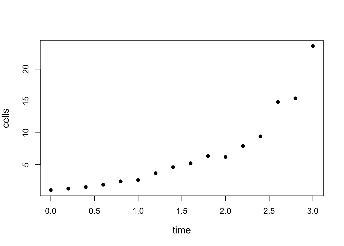
Figure 4.5: Plot of yeast cells over time.
The plot is clearly non-linear with an upward curve (exponential growth?). There is also a suggestion of an increasing variance over time. Nevertheless, we will go ahead and fit the linear regression to demonstrate its failings in cases such as this.
##
## Call:
## lm(formula = cells ~ time)
##
## Residuals:
##     Min      1Q  Median      3Q     Max
## -3.4894 -2.1234 -0.7112  1.3418  8.0061
##
## Coefficients:
##             Estimate Std. Error t value Pr(>|t|)
## (Intercept)   -2.148      1.435  -1.497    0.157
## time           5.919      0.815   7.262 4.14e-06 ***
## ---
## Signif. codes:  0 '***' 0.001 '**' 0.01 '*' 0.05 '.' 0.1 ' ' 1
##
## Residual standard error: 3.006 on 14 degrees of freedom
## Multiple R-squared:  0.7902, Adjusted R-squared:  0.7753
## F-statistic: 52.74 on 1 and 14 DF,  p-value: 4.144e-06
Comment: Despite the fact that the data is clearly not linear, the slope parameter is highly significant (\(p<0.001\)) and \(R^2\) is quite large (\(79\%\)).
However, if we plot the standardised residuals against the fitted values using the following R code we obtain:
plot(fitted.values(m1), rstandard(m1),
       xlab="Fitted values", ylab="Standardised residuals",
       pch = 16, cex.lab = 1.2)
abline(h = c(-2, 0, 2), col = "red", lty = 2)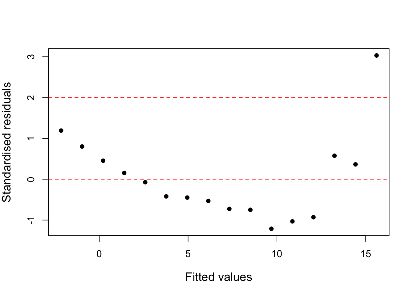
Figure 4.6: Standardised residuals against fitted values for the yeast cells model.
The plot has clear curvature and a fairly extreme outlier, showing that the model is inappropriate. However, we can use the fitted model in order to see how the likelihood varies with values of \(\lambda\). This can be done in R via the boxcox() function (in conjunction with a fitted model object). Note that we need to load the MASS library to use the boxcox() function. We can produce the plot and extract the value of \(\lambda\) that maximises the log-likelihood as follows:
library(MASS) # Load the MASS library
bc = boxcox(m1, lambda = seq(-0.5 , 0.5, by = 0.01), plotit = T)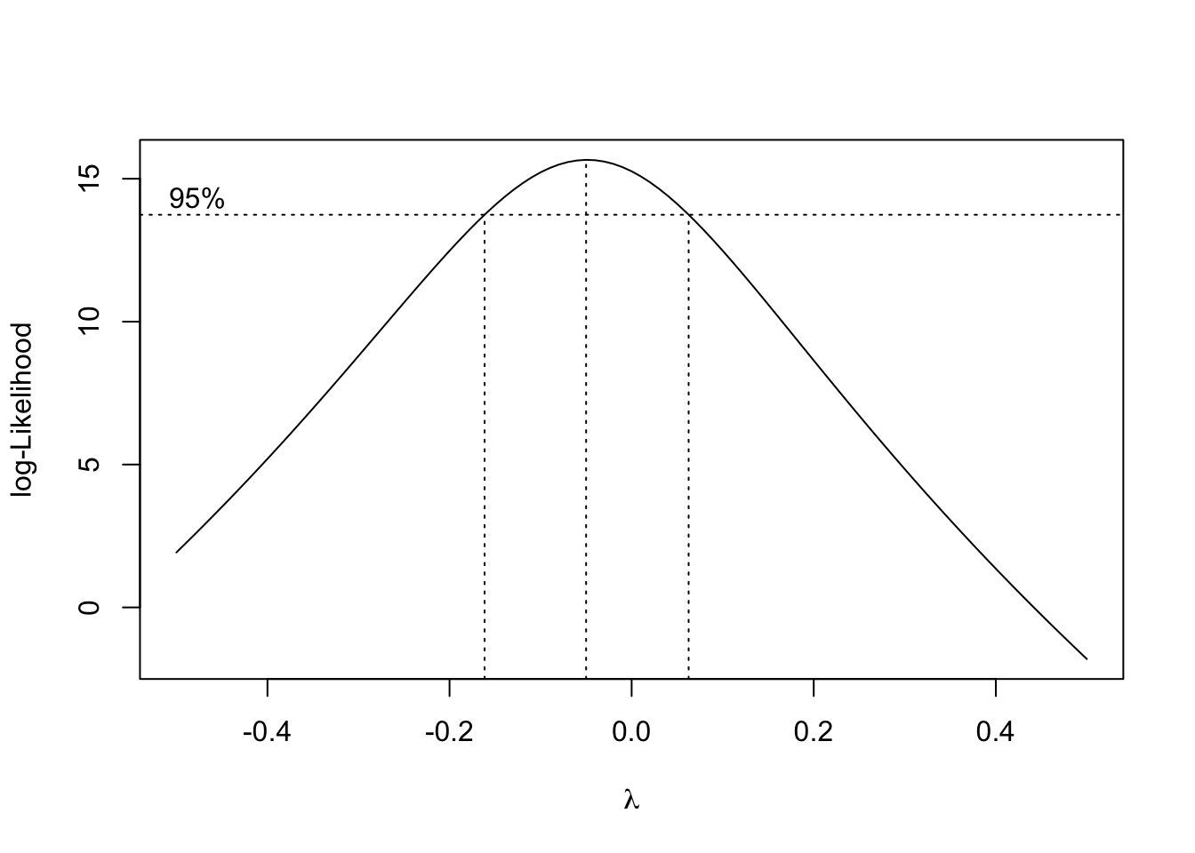
Figure 4.7: Values of the log-likelihood against lambda for the yeast cells model.
## [1] -0.05Comments:
- The above plots the log-likelihood for various values of \(\lambda\).
- We can see that the maximum is at about \(\lambda = -0.05\) (the central dashed line).
- However \(\lambda = 0\) is in the \(95\%\) range (between the left- and right-dotted lines) suggesting that a log transformation may be appropriate.
We can now try a log-transformed model, which we can summarise and perform model-checking in the usual way, i.e.
##
## Call:
## lm(formula = log(cells) ~ time)
##
## Residuals:
##      Min       1Q   Median       3Q      Max
## -0.17548 -0.06187 -0.00518  0.06664  0.16721
##
## Coefficients:
##             Estimate Std. Error t value Pr(>|t|)
## (Intercept)  0.01120    0.04916   0.228    0.823
## time         0.99450    0.02792  35.617 3.89e-15 ***
## ---
## Signif. codes:  0 '***' 0.001 '**' 0.01 '*' 0.05 '.' 0.1 ' ' 1
##
## Residual standard error: 0.103 on 14 degrees of freedom
## Multiple R-squared:  0.9891, Adjusted R-squared:  0.9883
## F-statistic:  1269 on 1 and 14 DF,  p-value: 3.887e-15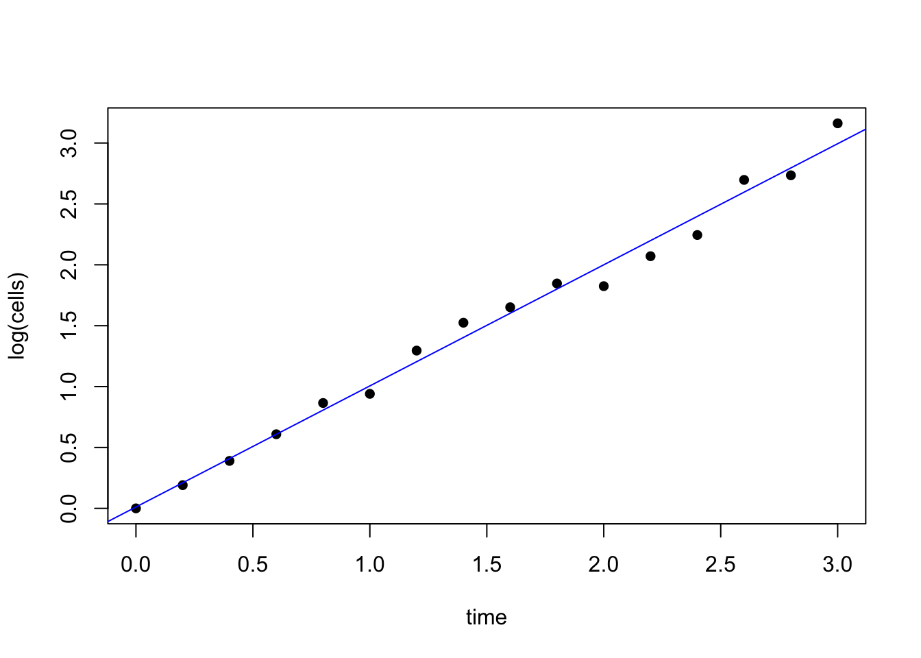
Figure 4.8: Standardised residuals against fitted values for the transformed yeast cells model.
plot(fitted.values(m2), rstandard(m2), xlab = "Fitted values",
     ylab = "Standardised residuals", pch = 16)
abline(h = c(-2, 0, 2), col = "red", lty = 2)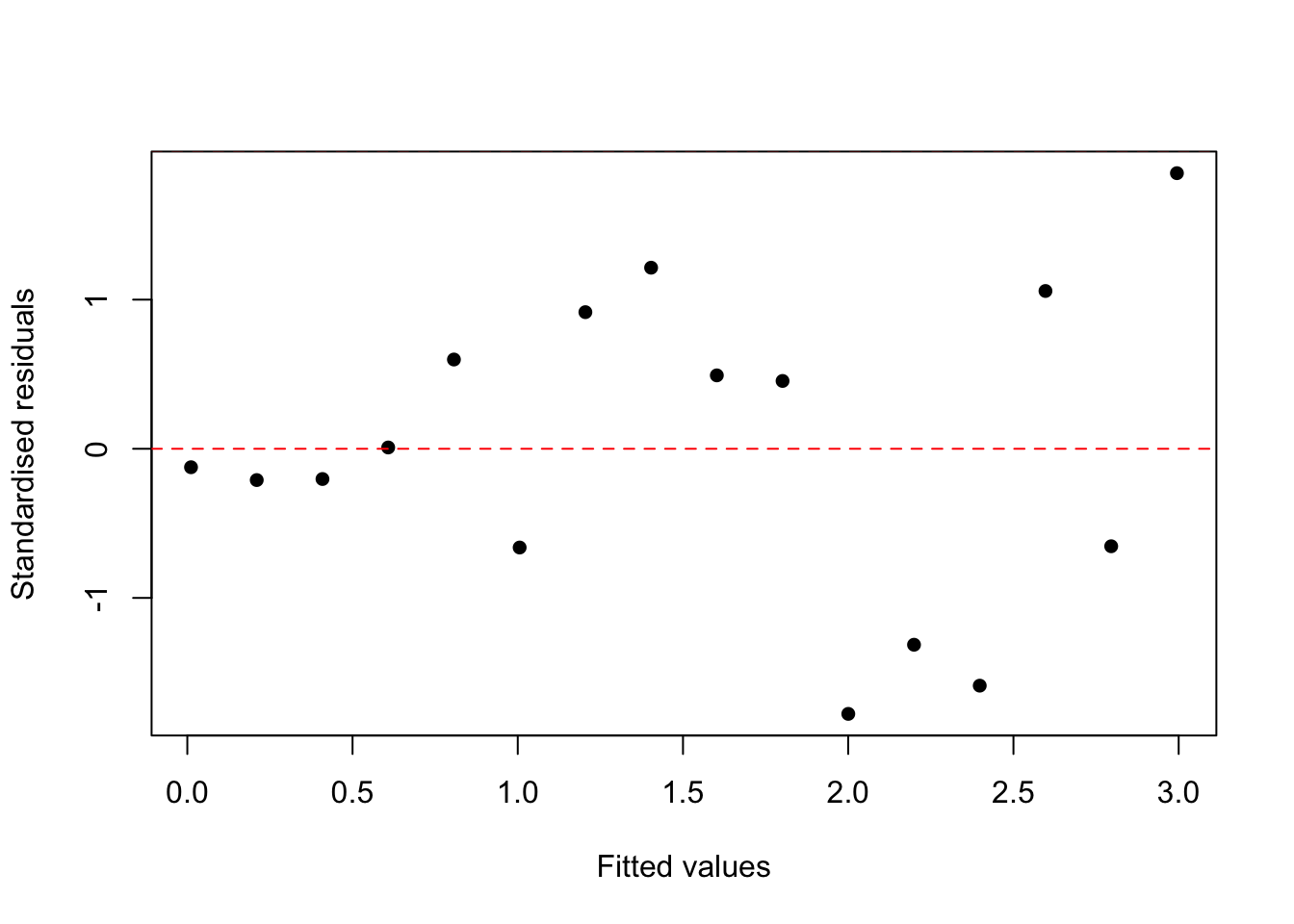
Figure 4.9: Standardised residuals against fitted values for the transformed yeast cells model.
Comments:
- The \(R^2\) value has substantially increased to \(98.9\%\) (from \(79\%\)), showing a much better model fit.
- From the first plot the transformed data seem to fit well to a straight line.
- From the second plot we can see that the curvature has gone, but there is still a slight suggestion of an increase in variance.
- All points are within \((-2,2)\) and so there are no outliers.
Other standard model checking should also be done, e.g. a quantile-quantile plot to check the normality assumption, alongside an Anderson-Darling test.
4.5.1.1 Transforming the explanatory variable(s)
The Box-Cox method only deals with transforming the response variable, although we can also model the explanatory variable as the response - as in multicollinearity - in a null model (see later). Sometimes it is necessary to transform the explanatory variables as well. If an explanatory variable has a very asymmetric distribution then the unusual values often become highly influential points. Transforming the variable to make the distribution more symmetric (e.g. taking logs or square roots) is usually desirable.